| |

|
|
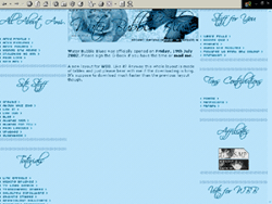
Site » Past Layouts
WBB's layouts over the years. See the layouts that I made for this site of mine.
 |
Version |
: |
10 |
|
Layout Name |
: |
Simplicity |
|
Screen Resolution |
: |
1024 x 768 |
|
This tenth layout of mine was done purely out
of boredom. The only thing that this layout involved is
some cheap tvlines background with gradient-coloured
background. The flower and leaves were put on the layout
for no reason but for the sake of taking up the big blank
green space. Mentioning green I find this layout to be
very green. Anyway the links are all images and thus they
were linked by the image-mapping link thing. It's a very plain and
boring layout, but I did spend quite a number of hours on
this layout because I keep on adding and deleting things
from and to the layout. However, I quite like the splash
page though.
Anyway this layout was made in Adobe
Photoshop. |


|
Version |
: |
9 |
|
Layout Name |
: |
Past Present and Future |
|
Screen Resolution |
: |
1024 x 768 |
|
The ninth layout is called Past Present and Future because on the layout Ive used pictures of Ami from the days of
Queen Serenitys reign to the days of Crystal Tokyo in the future and
since I am hopeless in the myth of love between Zoisite and Ami, I decided
to put a picture of Ami held by Zoisite and a small gorgeous picture of
Zoisite himself. Hehe... Anyway I have no idea that the layout is going to
turn out as it is because I have to say that it is simply gorgeous!
I wanted to have a big picture of Ami in a frame, but
since I can't make a decent frame, I decided to just tilt
the big picture of Ami and then give it dotted borders
with some sort of clips at the corners of the picture.
I simply fell in love with this layout when
it was finished and I must say that it looked like pictures of
Ami and Zoisite through the years on a table or on the green grass or
something like that, which means this is the first time I
actually succeeded in making a layout that does not divert
from the theme. Well I used a lot of
different effects and fiddling here and there with the pictures and in the
end it turned out as it is. Other than that I
dont think I have much to say about this layout as there is not much
difficulty in making it and I used the typical type of effects
anyone would use. Oh another
thing, I was told that this layout loads much faster than my previous
layouts. I find it weird because I saved the images in their original size
thus they are supposed to load really slow and this is a
pop-up layout.
|
|
Version |
: |
8 |
|
Layout Name |
: |
Amethyst |
|
Screen Resolution |
: |
800 x 600 |
|
This pop-up layout lasted for quite a while, well I am not sure
for how long actually but it did last for a couple of
months instead of weeks. It was created using Adobe
Photoshop and various fonts were used to make all of those
swirls. The background was filled with small fonts of the Quenya and Sindarin letters.
I wanted it to have some sort of an ancient feeling and
have that Celtic feel to it and at the same time gives my
visitor the feeling as if they are going through some sort
of dome or something like that. I was going to start my
Foundation Year the next day this layout was created and
put up on the website on the same day. Anyway this is the first time I used borders
for my layout and it is very simple with only little effects being used
like texture and gradient. I am quite proud how this
layout turned out though I am quite sick of looking at the
purple colour.
|
|
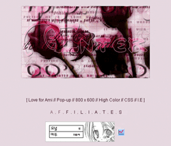
Version |
: |
7 |
|
Layout Name |
: |
Tern Ni / Waiting For You |
|
Screen Resolution |
: |
1024 x 768 |
| This seventh layout called Tern Ni means Waiting For You
in English. I got a friend of mine to translate 'Waiting
for You' into Chinese Mandarin. Anyway I have lost any
sorts of inspiration to create a new layout. I find this
layout to be really annoying, but I put it up anyway
because I have spent so many hours in creating it. I do
not want all that to go to waste. I wanted to make a
layout with a flowery theme, but ended up making a layout that
looks totally hideous. Quite disappointed as it didn't turn out as I
wanted it to. Well this layout was up for quite a while
and I used Adobe Photoshop to create the layout and the
rose was from a brush that I created. It's very sickly red
I know and the colours again got on my nerves.
|
|
Version |
: |
6 |
|
Layout Name |
: |
Frozen Reminiscences |
|
Screen Resolution |
: |
800 x 600 |
|
I wanted a layout that gives sort of a frosty feeling to
it so I made this layout. The layout is dedicated to Zhu Cong,
a character in the Chinese drama She Diao Ying Xiong Zhuan
(The Legend of Arching Hero). I know it has nothing to do
with SailorMercury, nor do I care if it doesn't. Anyway
the layout is made using Adobe Photoshop and I have so
much time on my hand that I decided to make the links as
images. Yes, that's right, all of the links are these
teeny-tiny images and so you can see that I have all these
teeny-tiny images to create in Photoshop and to link each
one of them, argh it was frustrating to create all of
those images and my head hurts from staring at the screen
for hours because of the links!
I really can't believe
that I bothered myself with the annoying links. Anyway I
have to say that I find this layout to be really hideous
and too simple for me, not to mention the colour just get
on my nerves. Anyway, this layout was used for WBB's 2nd
anniversary which is on 19th July 2004. By the way, at the
time the layout was put up, I had 1151 hits
as of 25th November 2003.
|
|
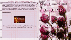
Version |
: |
5 |
|
Layout Name |
: |
Ethereal Roses |
|
Screen Resolution |
: |
800 x 600 |
|
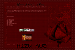
Oh this pop-up layout has to be one of my layout that I madly love! Anyway a lot of layering and different fonts
such as Akov were used and
a picture of a few stalks of roses from
gettyimages.com. All that I did was just paste the roses on top of one another,
but it took me
hours to make it look perfect. It was very ugly at first but after hours of perfecting
and layering and blending, I managed to make it look good. Tons of effects were used and only a few
butterflies and leaves brushes that I made were used too, but they were quite hard to see.
Anyway I used Adobe Photoshop 6.0 and Arial as the font.
|


|
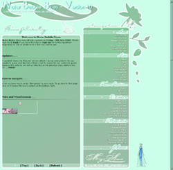
Version |
: |
4 |
|
Layout Name |
: |
Sunflower Garden |
|
Screen Resolution |
: |
800 x 600 |
|
This Sunflower Garden layout is too simple I guess.
Anyway Orange and yellow is not my color, but I used them for this layout
and the layout is made again using Adobe Photoshop. I wanted to
see how my want for a weird bright colour turned out. It wasn't as bad as I expected. Anyway the layout
eventually got on
my nerves and I felt sick of the orange color and put it down as cannot bear to see it
anymore and the fact that I made a new layout!
Though I
got tired of this layout, I love it none the less. This layout was very simple
with effects such as TV lines and a flower brush that I made myself and am very proud
that I did. The layout was put up on Monday, 28th July 2003.
It
did not even last for a month! Someone said that the theme for this layout is cute and
I do think so, but still am annoyed and sick looking at this bright-coloured layout.
|
|
Version |
: |
3 |
|
Layout Name |
: |
Untitled |
|
Screen Resolution |
: |
800 x 600 |
|
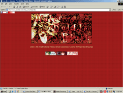
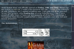
I must admit that this third layout of mine was done due
to boredom and it has nothing that reflects Ami Mizuno
a.k.a. SailorMercury. OK, maybe a part of this layout has
something to do with the mentioned character. Well, the
raging sea reminds me of SailorMercury's rage when she was
provoked. I wanted to tell people something along the
lines of "Feel the wrath of SailorMercury!" or
something stupid like that. Adobe Photoshop was again used
for this particular layout and this layout was actually
put up as a replacement for my second layout. Like I said,
I couldn't stand the sight of seeing my second layout any
longer and while waiting for a new brilliant layout to pop
into my mind I decided to create a quick layout and pasted
it on the site, thus getting rid of my second layout while
await for a brilliant third layout to form in my mind.
|
|
Version |
: |
2 |
|
Layout Name |
: |
Untitled |
|
Screen Resolution |
: |
800 x 600 |
|
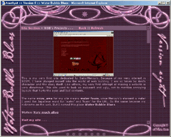
This is my second layout which lasted for a few months
(can't remember how long) and I got sick of it, though
a lot of people seemed to like the layout a lot. I like it too but the
blue colour and the simplicity of it just got on my nerves
and the layout itself screamed at me to get it down.
Anyway this layout was made using Adobe Photoshop and for
the background I used the Gradient Tool and as for the
links; they are on the picture of Ami where I drew boxes
and typed in the links and put each of them in their
specific boxes. |
|
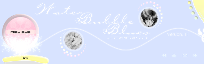
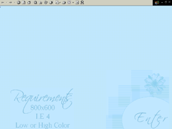
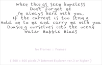
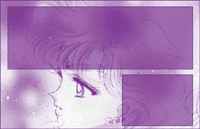
Version |
: |
1 |
|
Layout Name |
: |
Water Bubble Blues |
|
Screen Resolution |
: |
800 x 600 |
|
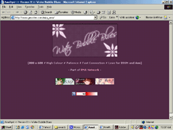
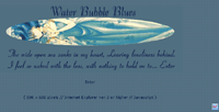
My very first layout! Ugh, look how horrible it is. Well
you have to start from somewhere do you not? Anyway, the top
picture is the splash page layout and the very purple one is the main page
layout. I did not use tables and dividers for this version
of my layout and oh I made different layouts for each page.
Can't believe that I bothered myself to make so many
layouts for each page on Ami. Well the reason behind this
is because I was excited
for people to see my layout making skills at that time. I
have no idea what font I used for the splash page though I
do have a soft spot for the short both the poem that I
wrote for my splash page and the font too.
|
|