Introduction
The thinking behind this project revolves around
humanity's constant
need
to define and promote itself through signs. The publicly visible
lettering
on buildings and structures in a busy port, market and industrial town
like
Ipswich has been used for decades to communicate with the passer-by.
This
practice can probably be dated to the beginning of the Industrial
Revolution
in Britain (sometimes pinned down arbitrarily to about 1760), when the
rise
of capitalism resulted in the need by industrialists and businessmen to
advertise, self-promote and proclaim commercial power.
The Twenty-first century sees us facing more and more invasive ways of
advertising
brands and services, particularly given the impecunious nature of
public
services and their desire to obtain sposorship from commerce in order
to
save money wherever possible*. This current climate of 'private/public
partnership'
is a world away from that prevailing a hundred or so years ago when
corporations,
tradespeople, factories, businesses and all sorts of private
individuals
marked their existence with the aid of signwriting and public
lettering.
[*Not that we would ever encounter that sort of problem with
advertisements
on the Internet...]
A photographic
comparison
 -
-
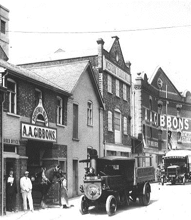
The photograph of the upper end of Benezet Street
(above) demonstrates
the
use of bolt-on and painted signs by a flourishing flour-milling
business,
Provender Mills and West End Mills owned by A.A. Gibbons. Alfred
Alexander
Gibbons set up his corn business in Benezet Street in the 1880s, the
monochrome
photograph having been taken in the 1920s. The far building with its
angled
Paladian frontage is adorned with three sets of painted lettering: the
owner's
name, the street name (close to the corner with Bramford Road) and the
smaller
'To Order Office' directing customers down the road. Although a fairly
narrow
street, the proprietor clearly saw the need to stamp his name clearly
on
the far building which would have been partially visible by those
passing
on Bramford Road. The colour photograph taken from a similar position
in
2001 (the nearest buldings have been reshaped or demolished) shows a
typical
modern approach to the utilisation of industrial buildings as
attractive
office and accomodation spaces. The brick-cleaning companies have been
in,
frontages repaired, windows and features altered and all signs have
been
removed.
One of the finest expositions of the signwriters art must surely have
been
that shown below: a veritable symphony of signs!
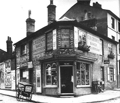
At the corner of Fonnereau Road and Crown Street (site
of the present
Purple
Shop), here is E.R. George's bakery in 1911. Reading from the left:-
BAKE OFFICE (above the hand cart),
E.R. GEORGE: BAKER & PASTRYCOOK (repeated on the opposite corner),
NOTED FOR PURE WHOLE MEAL BREAD,
PARK BAKERY (with curlicues above and below),
repeat of main sign,
unreadable lettering in bricked up window (probably the proprietor's
name
and trade repeated),
REFRESHMENT ROOM (behind the 'TEA ROOM' sign),
not to mention all the advertisements and posters!
The blank wall beside the premises has been colonised by bill-posters.
In
those somewhat gloomy times such colourful, graphic, printed matter
might
have ben welcome and it is only in recent decades that Ipswich Borough
Council
has taken a stance on the proliferation of billboards and advertisments
in public places. The environment now is radically different and once
the
billboards were removed, new views into formerly hidden areas and
spaces
were revealed.
Another striking exercise in trade lettering adorned the angled side
wall of number 46 Norwich Road (now the Maharani Indian Restuarant
which still has an interior illustrated ceramic wall showing people and
dogs on a shoot, which was behind the original shop's game counter, the
sister mural - perhaps showing fishing? - having been demolished
by the builders during conversion to a
restaurant before it was spotted by a
conservation officer). This wall is seen by people coming from the town
and it originally bore the lettering:-
W. RUSH
WEST END
FISH, GAME
& POULTRY MART
ICE IMPORTER
but is long gone. A photograph inside the restaurant shows the shop
with its meat and game hanging over and around the entrance and this
sign proudly displayed (we would guess from early part of the 20th
century). We will try to track down tho period photograph for this site.
A collaborative resource
The main feature of this website is to provide an
authoritative
commentary
and amass historical detail by a collaborative process. If some of the
text
is misleading or just plain wrong, we want to hear about it and correct
it, so that the site grows as a resource of historical public lettering
and the local history of Ipswich. We are particularly keen to hear from
residents who recall the streets, businesses and features depicted in
the
galleries; also the types of trades involved, anecdotes about the areas
and people of Ipswich.
Please email any comments and contributions by
clicking here.
The extant
lettering around the town represents a link to a
bygone
era.
The technical side of lettering
We hope to research this more thoroughly with
commercial signwriters in
the future.
Suffice to say that the art and craft of signwriting is, perhaps, a
dying
one. The use of ladders, scaffold, mall-stick and signwriter's brushes
and
paints to create a sign on a wall is far more challenging than that
done
on a removable board which can be created in a workshop and fixed in
place
(the latter being intrinsically temporary). This is particulary true of
the more out of the way sites such as the chimney stack above the
former
Symonds Chemists Shop in Upper Brook Street.
Today, more and more flashy effects can be achieved by the use of
plastics
and metals in sign-making: a rather different activity. The emphasis
throughout
this site is on painted lettering, principally on brickwork and
rendered
surfaces which tend to stand the test of time. There are also examples
of
lettering incised into the fabric of buildings such as at the top of
the
frontage of the Bethesda Church, St
Margarets
Street, or lettering built out in relief on a surface, for example The
Unicorn in Tacket Street or The
Central
Livery and Bait Stables in Princes Street.
There are therefore implications in this project for design and
architecture,
too. Not to mention the practical problems of painting onto a porous
surface
where the lettering is intended to last for years. The examples of
painted
signs for local businesses such as Elliott
Street Bakery - a remarkable survivor - show how a number of
versions
are overpainted as the years pass and fashions change; then weathering
and
degrading of the paint surface result in the earlier lettering becoming
visible. This is the very embodiment of social history in a very humble
and largely forgotten feature of the town.
Inclusions and exclusions
Although we have not adhered to strict rules about
inclusions and
exclusions,
the examples photographed must exhibit some age and durability since
their
original creation. The signs on Church's Restaurant in Hatton Court and
pubs
such as the Milehouse (formerly the Mulberry Bush) in Woodbridge Road
and the County Hotel
in St Helens Street have all the appearance of period lettering, yet
have been painted only
recently. This false 'olde worlde' approach to public lettering has its
interest, but falls outside our brief.
The Grand Old Duke of York on the corner of Woodbridge Road and Warwick
Road brings to mind those lettering examples which
we have lost. That particular pub boasted some rather fine frosted
glass
decoration in its former incarnation. It is to be hoped that when
Adnams,
the Southwold brewers, refurbished the premises they preserved the
wonderful
door to the left of the frontage which led to a corridor and short
'private'
part of the bar for off-sales; the door bore the frosted word: 'Jugs'.
Hales
Chemists in St Helens Street (opposite the Regent)
was in business for
many
years and was only recently closed down with the opening of a chemists
shop
within the Orchard Street Health Centre nearby. The lost lettering
proclaiming
the business name in black and white mosaic on the entrance doorstep
was
only spotted by chance and was soon obliterated with dark grey paint by
the new owners: a bespoke tailors (one of several such businesses
recently
established in the town). Our only hope is that the wear and tear
caused
by shoes and boots will continue the erosion already visible on the
step
and finally reveal the lettering once more; we now include a page for Hales
Chemist.
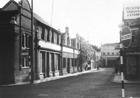
The above 1960s photograph of Great Colman Street from
the corner of
Old
Foundry Road by Jim Lewcock shows a rake of buildings on the left long
demolished
to make way for the Social Security block and Carr Precinct, since
superceded
by the QD development. At this time, the rather attractive frontage
housed
Rands & Jeckyl, the tent makers, and the small street about half
way
down, Little Colman Street (now an access to a ramp leading to upper
parking),
cut through to Carr Street. The facing building at the end of the road
(itself
in Northgate Street) has been an Assembly Rooms, a girls school, Egertons
motor engineering works , a dry cleaners, Mortems stationers and The
Chicago
Rock Cafe. The part of the photograph which drew our attention, though,
is the end wall of the stores to the upper right. Until recently this
was
Websters office furnishers, stores and auction rooms and presumably
that
company was responsible for the obliteration with white paint of the
earlier
tenants: 'Pickfords Removers and Storers'. The great white panel, just
made
for advertising lettering, was still there until recently, albeit
somewhat
flaking
and discoloured. As of 2005, the Websters building has been demolished
for housing redevelopment.
All the time, we are in danger of losing these historic examples of
lettering.
Since starting this website we have lost John
Good and Sons (G.C.B.) Ltd on the Wet Dock, where the Waterfront Regeneration Scheme
has removed several examples. Abrasive brick-cleaning, overpainting
with a textured masonry paint,
rendering
over with cement or rough-cast all threaten to obliterate our history.
It
is intriguing to contemplate what might eventually happen when such
sufaces
weather and crumble. If the buildings stand for long enough will they
once
more yield up their secrets, covered up and (one hopes) protected for
so
long? There are sites where the enthusiastic use of a red brick paint
to
cover lettering has followed the contours of the characters rather too
slavishly
and with the passage of time, only serve to make them readable again.
The
R. & W. Paul maltings at the rail
station
end of Princes Street (Hollywood / Kartouche / etc. night club) is a
fine
example.
We have tended to shun signs and characters which are fixed to walls
and
favour those painted onto them. However, there are road
and street signs (which carry their own unique history) and other
exceptions
where they carry the weight of the past. We have tended to avoid
eccelesiastical
lettering as the many churches in the town have grave stones and
memorials,
as well as architectural lettering which are all strictly speaking
'public'
and which are a subject in themselves.
The original images on this site (which usually read very well as
photographs)
sometimes lack definition when scanned and saved as 'gif' files (to
save memory). We
have
therefore tried to provide close-ups, adjust contrast and colour
balance
in some cases to enhance visibility of the lettering. This can result
in
a rather unreal feel to some images. Since 2005 we have used only
jpeg images.
[UPDATE 25.10.04: Borin Van Loon gave a talk on this website project
to the annual Recorders' Day in October, 2004 organised by Suffolk
Local
History Council which exists to encourage, promote and assist the study
and research of local history in the county of Suffolk. We hope for
much
feedback from this source, so that we can fill in many of the gaps on
the
site. They proved a receptive, knowledgeable and enthusiastic audience;
it was good to share some of the images and the thinking behind the
website
with them.]
[UPDATE 15.11.06: We have ditched the Guestbook from the Homepage due
to endless spamming, so please send comments by clicking here. Thanks. Also citations to published
books in the text have been gathered together in a Reading
List.]
Home
Copyright throughout this site belongs to Borin Van Loon, 2003.