Porticos
Architectural features fronting public buildings often
provide spaces for
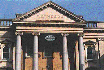
integral lettering. The most conventional is the Bethesda Baptist
Church: a
chisel-style
sans serif capital letterform ideally suited to the temple-like,
columned
portico, the pediment supported by four small columns. The building
dates from 1913 and was funded by Mr Arthur Page, a Bristol lawyer, as
a memorial to his mother who died in 1911 at the age of eighty-two.
Bethesda was originally the name of a pool in Jerusalem, on the path of
the Beth Zeta Valley, and is also known as the Sheep Pool. It is
associated with healing.
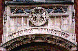
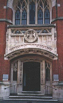
A more intriguing letterface appears above the
Northgate Street entrance
to the County Library. This wonderfully eclectic Victorian frontage
with
its arches and stained glass boasts an imposing entrance. Beneath the
false
balcony is a circular moulded crest (see also Ipswich
Board School in Argyle Street - the close-up below surely shows sea
horses rampant supporting the town shield?) and below that the serif'd
letterface
in capitals which seems to blend medieval and art noveau influences.
Given
Chaucer's presence in the stained glass and the traditions upon which
William
Morris's Arts & Crafts Movement were based, that's about right.
 -
-
Truly the entrance to a cathedral of knowledge,
learning and reading, the
gently curving lettering above the door say it all. The refurbishment
of
this fascia accompanied a major extension of the library buildings in
the
mid-nineties. The curved and decorative ceilings and fine stained glass
(principally in the Lecture Hall and Reference Library's Northgate
Room)
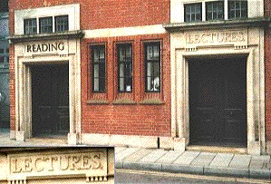
have been preserved. Meanwhile, hiding round the corner in Old Foundry
Road
(opposite Ewers Grey-Green Coaches)
are
the 'Reading' and 'Lectures' entrances to the Library's Reading Rooms
and
Lecture Hall with attractive typefaces used on the lintels of these
(now)
false doorways - the entrance since refurbishment is just visible to
the
left of the photograph below. So, why has one got screwed-on characters
and the other carved characters (repleat with full stop: always an
oddity
in old signs)?

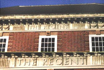
Hiding in the shadows of the roof overhang on the front
of the largest live
venue in East Anglia, we find The Regent in St Helens Street. Partially
restored in the eighties, it's certainly a cleaner fascade now, the
lettering
more readable. For many years this was called The Gaumont Cinema (plus
a
small dancehall), live music and drama being slotted between the film
shows.
All those years with hardly anyone noticing the lettering of the
original
name, reverted to since restoration, high above the entrance.

The detail in the lower part of this image shows 'THE
REGENT' picked out
by the setting sun. The clean clear capitals have a typically art deco
feel,
but shouldn't that 'G' have more of a middle bar? It reads more like
'Recent'!
Home
Copyright throughout this site belongs to Borin Van Loon, 2003.

 -
-