
- Enter descriptions for each event in column A. Column B contains the start date for each
of the event. The start date can be a equal to the end date of an event, so that any
changes to that start date will change this start date. Column C contain the duration for
each event in days. Column D will contain the end date for each event, by adding column B
and C. Column D is not used in the chart.
- Created a stacked horizontal chart for data in A3:C11. The Chart Wizard will probably
guess these series incorrectly, so you’ll need to set the category axis labels and
data series manually. Set the axis as follows:
category x axis label should be A3:A11
Series 1 data should be B3:B11
Series 2 data should be C3:C11
- Remove the chart’s legend and adjust the weight of the chart so that all of the
category axis labels are visible.
- Select the data series that corresponds to the data in Column B and right click to
access the Format Data Series dialog box. Set Borders to None and Area to None. This
essentially makes the first data
series invisible.
- By now you should have created the program chart. Try to change the duration
of any
event and see how the chart update itself.
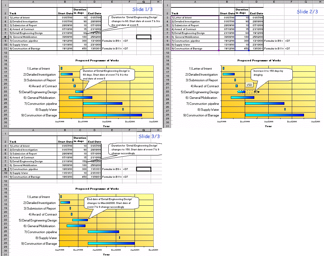
- Try to drag the 'Detail Engineering Design' bar, the chart will adjust the start date of
'Construction Pipeline' and 'Construction barrage' start date accordingly.
- The slide show below demonstrate the effect of the dragging the 'Detail Engineering
Design' bar.

The above sample is available for downloading.

Thanks to for hosting this page. Get
your own free home page too.

![]()

![]()
![]() for hosting this page. Get
your own free home page too.
for hosting this page. Get
your own free home page too.