Rainbow Text
In this tutorial, you are going to make this image:
|

![]() Start
with a new image roughly 300 X 150 X 16 million colors
Start
with a new image roughly 300 X 150 X 16 million colors
![]() .
Using your text tool
.
Using your text tool
![]() ,
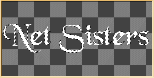
Add some text to your image with your foreground color set to white. I
used Black Chancery set at 48 point with the text "Net Sisters". Do
not deselect the Text. Your image should look like the one to your
left.
,
Add some text to your image with your foreground color set to white. I
used Black Chancery set at 48 point with the text "Net Sisters". Do
not deselect the Text. Your image should look like the one to your
left.
![]() Now,
click on Selections--> Save to Alpha Channel. A screen will appear
that resembles this one. Text you typed may not look the same, but
the concept is essentially indenticle.
Now,
click on Selections--> Save to Alpha Channel. A screen will appear
that resembles this one. Text you typed may not look the same, but
the concept is essentially indenticle.

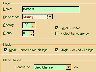
Now, create a new layer. Select Layers--> New... and name this layer:
Rainbow. Once the Layer Properties window pops open, you will enter
your information as the following figure
demonstrates.
![]() Once
you have entered the information to your right, you will have a new layer
over the original layer with nothing in it. Select Selections from
the tep menu, Load from Alpha Channel, and click on the privious selection
you saved. You will now see the marching ants appear around the text you
put in the original layer, but they will encircle nothing in the rainbow
layer. This is your rainbow area. Pick any color you wish to start you rainbow
with. I choose a Redish-Orange to start. Using a sweeping 45 degree angle,
I made a quick stroke with my airbrush. I then changed colors for my next
color.
Once
you have entered the information to your right, you will have a new layer
over the original layer with nothing in it. Select Selections from
the tep menu, Load from Alpha Channel, and click on the privious selection
you saved. You will now see the marching ants appear around the text you
put in the original layer, but they will encircle nothing in the rainbow
layer. This is your rainbow area. Pick any color you wish to start you rainbow
with. I choose a Redish-Orange to start. Using a sweeping 45 degree angle,
I made a quick stroke with my airbrush. I then changed colors for my next
color. I went from Red to Yellow. Yellow to Green. Green the Light Blue. Light Blue
to Dark Blue. Each time, I made sure I overlapped my current color with the
previous one just a bit to give the blend effect of a rainbow.

![]() As
you can see, the effect also produced Orange, Lime Green, Sea Foam Blue,
and Midnight Blue. I know, it doesn't look to Rainbowish now, but we need
to adjust the transparency level of the Rainbow layer. This is what the actually
rainbow comes from. Like a true rainbow, the raindrops (paint colors) feed
on the light (white text) creating a prism (transparency level adjustment),
what you see when you look at a rainbow is all the colors of the light shining
through the raindrops. Since white is all colors combind, the prism, raindrop,
seperates it into the actual make up of the colors. Following this Mr.
Wizard explanation is how to set the transparency of your rainbow.
As
you can see, the effect also produced Orange, Lime Green, Sea Foam Blue,
and Midnight Blue. I know, it doesn't look to Rainbowish now, but we need
to adjust the transparency level of the Rainbow layer. This is what the actually
rainbow comes from. Like a true rainbow, the raindrops (paint colors) feed
on the light (white text) creating a prism (transparency level adjustment),
what you see when you look at a rainbow is all the colors of the light shining
through the raindrops. Since white is all colors combind, the prism, raindrop,
seperates it into the actual make up of the colors. Following this Mr.
Wizard explanation is how to set the transparency of your rainbow.
 Go to
your layers pallet. On your rainbow layer, adjust the transparency
level to something that suites what you want. I used 51 here which
created this nice
image:
 The colors bled nicely into the white background which gave the impression
of a rainbow casting reflection off the letters. OK, you can go further
if you want. You can use Eye Candy to give it a glossy glow, blade
pro to set it in a glassed effect, or use plain old PSP to give it a drop
shadow and make it "pop" off the page. Here, we will give it a drop shadow
to give it A: Height B: Texture C: Depth
 OK,
create a new layer named Drop Shadow. As I have done here. Click on
Selections-->Load from Alpha Channel. Select the entry you have made
which would be the original selection. Now, Hit
Image-->Effects-->Drop Shadow. The following Popup screen will
appear. Enter the attributes as I did here. Make sure you are
in the Drop Shadow layer
first.
 You can adjust and play with the settings, but these ones give you a nice
clean crisp drop shadow that creates the illusion of your graphic popping
off the page. The above image is not the same as what I was doing here,
I changed the colors a bit so you could see the difference a little color
creates. The image below shows what your finished image will look like,
or at least what it can look like. Since everyone is different, and
there really is no right or wrong way to do things, every artist that lives
inside of each of you will create something different. Following the above
guide to a Tee still won't produce this image. Changing your Brushes
for your airbrush will create an even more different image. If you
use the Luner brush with
 your
painting of your "rainbow", you will get a kind of rippling effect on the
face of your image. If you use the Woodgrain brush, your image will
take on the effect of running water with colors in it. Last, but surely
not least. You must combine the layers before you save as gif, jpg,
tif, bmp, or anyother format except for PSP, or PSD. Those two formats accept
the use of
 layers
within an image, but will not display on your webpage, so please keep this
in mind, or you may end up with an image that only shows one of your layers.

