Much of the debate over the authenticity of the lunar landings centres on analysis of the photographs issued by NASA of the lunar surface and the astronauts activity thereon. Not to look at some of the evidence for the theory would be a major oversight of any study, so I have looked at some images and provided my thoughts and comments on them.
All images, without exception, have been sourced directly from NASA and have not been altered by the author except to reduce the size of the actual image, for the express purpose of reducing download times, or where I have blown up small sections of the pictures to illustrate my point, where the full size image would not reveal any anomaly.
I urge you to look at the NASA images which are all available on the internet from NASA's own Apollo Program server. I have included a link to each image on the NASA server, so that the reader can download the full image themselves and draw their own conclusions. Click on the main picture for each section.

|
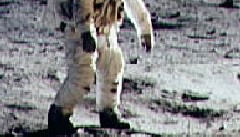
APOLLO 14 This first image shows Alan Shepard posing with the US flag. His shadow, that of a parabolic antenna, the lunar lander and the astronaut taking the picture, Edgar Mitchell, can clearly be seen. The apparent single light source can be seen reflecting in the visor of the astronaut, but yet the shadows from the objects are not in parallel lines, as we would expect to see from a distant light source, such as the sun. Also note the very short distance to the horizon behind the astronaut. This is a very common feature of lunar pictures, often blamed on the curvature of the moon - which is a little strange as there are other photographs with long distances to the horizon. |
 |
APOLLO 11 This is a picture of 'Buzz' Aldrin setting up the EASEP experiment on the lunar surface. Here we can see Aldrin, the LM and the US flag. Note how the sunlight is casting shadows at a right angle to the direction of the camera. The right side of the LM is bathed in light, whilst the left side is dark black, with virtually no detail visible. Aldrin's front, facing to the left of the picture, is darker, but not in the same kind of shade as the LM - why not? In fact the most startling item about this picture is the shadows cast Aldrin himself. It appears to be behind him. Is this a cardboard cut-out? |
 |
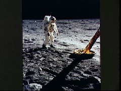
APOLLO 11 Probably one of the most famous images of the entire Apollo program. The picture is of 'Buzz' Aldrin, taken by Neil Armstrong. The radio antenna connected to the PLSS (Personal Life Support System), which was clearly visible in the previous picture has disappeared. Also, take a very close look in his visor. You can make out the image of Neil Armstrong, just to his left there appears to be a brightly lit object floating in the sky - what is this? Some claim that it is the US flag, but it looks too far away from the LM (see previous picture also) and possibly too large. |
|
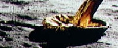
APOLLO 11 At first there does not appear to be anything wrong with this picture of Aldrin and the leg of the LM. However, there is something frightenly strange about this picture. On very close examination, as can be seen in the second and third pictures, you can see two distinct lines running the entire width of the picture, like a join, where separate images were spliced together, badly. The first line runs right through Aldrin's knees. It can clearly be seen to the right of his legs in the second picture. On close examination, you can see that his legs do not join properly at the knee - yet, the full picture looks normal, it is only under very close scrutiny that these anomalies become visible. Are these a product of a hastily completed forgery in the late 1960's? The second line runs through the foot of the LM - it essentially separates the light areas from the dark ones, if you magnify the image, you can see that the pixels either side of the line simply do not match. |

|
APOLLO 11 Another picture of the leg and pad. This image has a slightly more disturbing irregularity. A small rectangular section of the picture seems to have been 'inserted' into the original picture. Looking at the closeup reveals more detail. The top of the rectangle, in the second picture, runs horizontally from left to right, from the bottom of the pad. It's easier to see on the left side of the picture. Another line is visible near the bottom of the picture. You can see that there is a distinct rectangle where the pixels do not match. Why would they do this? This is clearly not the result of any kind of operator error when scanning the pictures, such an error would not under any circumstance, produce a rectangle that appeared to have been altered. Note how the pad appears to rest on a hard surface, it has not sunk into the powdery surface. |

|
APOLLO 11 Another shot of Aldrin setting up the EASEP experiment. Here we can clearly see the imprint left by his last footfall. It would appear to be about 2 inches (50cm) deep. Now compare this with the LM pad in the previous picture - the LM is considerably heavier than Aldrin. His radio antenna has disappeared. |
 |
APOLLO 11 Aldrin setting up the solar wind composition experiment. Note that the radio antenna has disappeared again. It should be at least partially lit in this picture, but there is no evidence that it is there at all. Also note the contrast between light and shade. |
 |
APOLLO 11 Another famous image - Aldrin descending the ladder from the LM. The shadow of the LM on the ground, indicates that this side of the LM is not in direct sunlight. Comparing this with other pictures of the LM, it should be in complete blackness, but it isn't. Some areas of the gold foil are not reflecting any light, yet Aldrin's EVA suit (Extra-Vehicular Activity) is well lit with no apparent shadows at all - stark contrast to the other pictures. |
 |
Finally, an image from the live telecast from the Lunar surface. The quality of these pictures is so poor that they could easily have been anywhere at all. The viewing public would not have been able to discern any detail problems as the image resolution is very poor. |
My final comment here is that many of the black & white pictures (not shown - see the NASA image archives for examples) from the Apollo 11 mission were of quite poor quality, yet the colour images from the same mission are well focused and perfectly exposed. In the late 1960's, black and white film processing was likely to result in a clearer, sharper image than a colour print - yet this is not the case in the pictures released by NASA.
Of a total of around 16000 pictures taken on the Apollo 11 mission, only a mere handful are available on the internet.
The images are the property of NASA. Their use does not imply approval or recommendation by NASA. I would like to extend my thanks to the good people at NASA for making these pictures freely available.
Back to moon landings
|
Vendemen - 27 January 1999 |